Bauhaus Inspired
The Bauhaus movement that came out of Germany almost a century ago has had an undeniable influence on the design world that continues to this day. To be honest, I’ve never consciously examined its influence on my own work, which has been focused on the web since the mid-90s. The biggest influence on my work, for the better part of my career, was rooted in what was possible. What was possible in a fractured web environment? What was possible in a world with limited standards adoption? What was possible with early CSS specs. It was, frankly, an age of ugly-but-practical design.
The modern web has changed all that. As designers, the world is our oyster. But rather than return to the days of “this site is best viewed in…” and mystery meat navigation, it’s all about standard practices and standard design patterns. Give people what they already understand. Not bad advice and everyone should read Steve Krug’s book, “Don’t Make Me Think” for his excellent take on the subject, but it’s also given way to a web with very little experimentation or art design.
Art design, both on and off the web, is something that’s been on my mind a lot lately. There’s an art and a science to design and I’ve been a little too firmly rooted in the science side of it. As a designer, that focus has allowed me to provide a solid ROI to my clients and a sane experience to my clients’ customers. But, more and more, that’s not enough for me. I want to explore the artistic side of design and lean into the experiences I’m creating for people.
What does that have to do with the Bauhaus movement all those years ago? Coincidental timing. Adobe is launching a series of fonts based on sketches and unpublished letter fragments from the Bauhaus school of design. As part of that launch, they’re also sponsoring a series of design contests (challenges) to use the fonts as part of a brand identity. I thought that was a great way to explore Bauhaus design, its history, its emphasis on modernism and bold shapes, and its architectural influences.
The current challenge is to design a humble business card. Those little three-and-a-half inch by two inch cards provide a very big canvas.
This is the card for Mission Control, a boutique creative staffing agency that will be launching in Austin, TX.

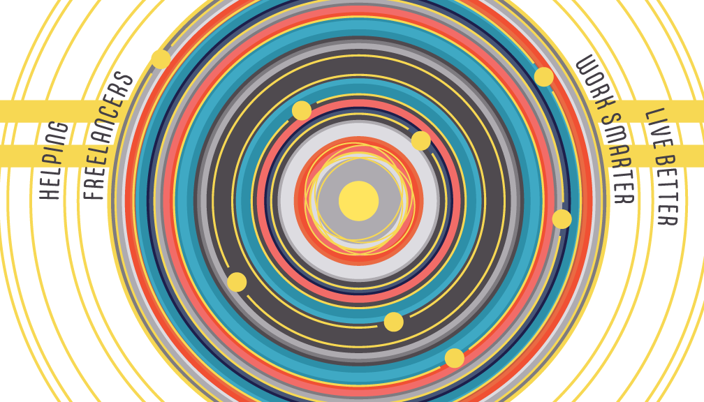
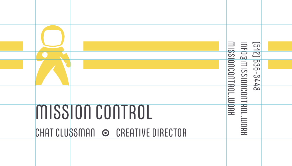
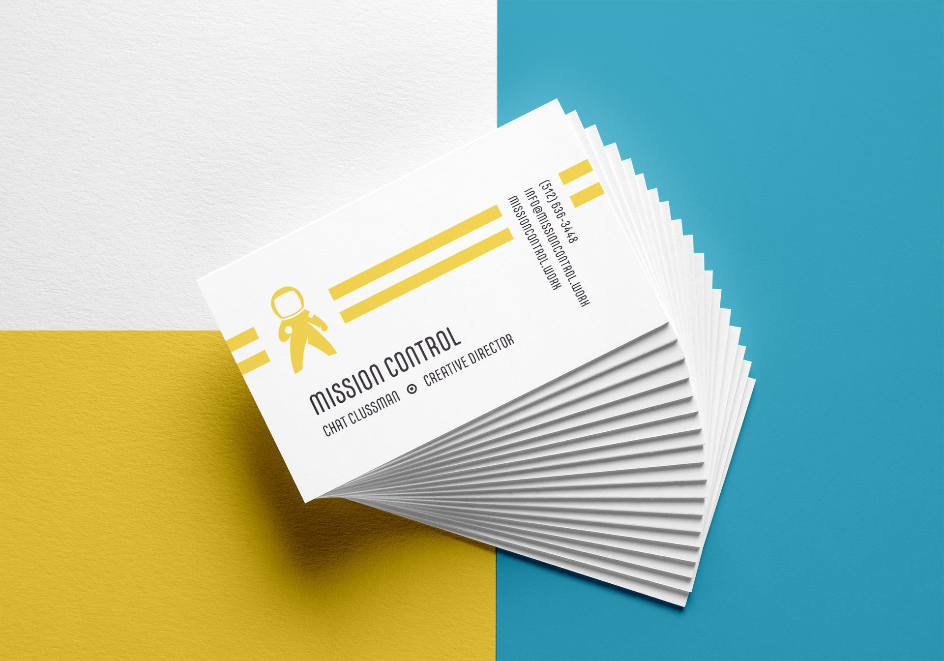
The font used for this card is CarlMarx Regular and is based on work done by, you guessed it, Carl Marx. The font was restored and digitized by Hidetaka Yamasaki. Marx’s work was colorful and came from “a world removed from reality.” His font was the perfect fit for a colorful brand whose logo is literally an astronaut. The rounded curves of the font also harken back to the modernist NASA logo of the 80s that was part of the inspiration for this brand’s identity.


