Kicking Ass for Good
Impact Dyslexia (ID) came to me to develop their brand, their pitch, and their website.
My son has dysgraphia so their cause is near and dear to me. If you’ve ever had a teacher ignore your child’s 504 plan and tell you that he or she is just lazy, you have friends at Impact Dyslexia. (Yes, that actually happened to us.)
Beyond the cause, Impact Dyslexia is super interesting from a branding perspective. They have two very different audiences and they want to address those audiences in very different ways and with a different tone, but with one brand and one voice.
One audience is dyslexics and their families and friends. Their brains are wired differently, with a lot of pros in terms of how they think and ID wants to support them. The X for that audience is a superhero mark and a nod to the classic X-men.
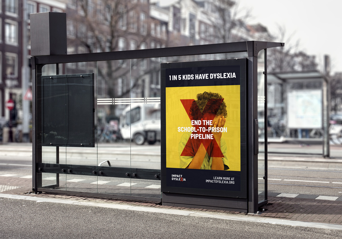
The other audience is the education and government institutions that are failing dyslexic kids and ID wants to be pretty in their face about making some changes. For that audience, the X represents eliminating the obstacles dyslexics face and the systemic issues that arise from that.
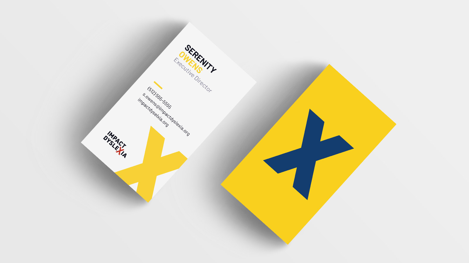
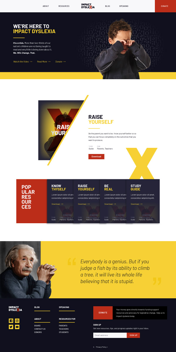
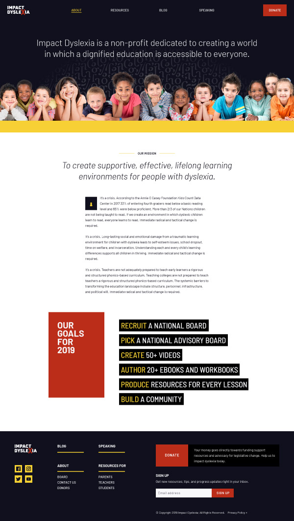
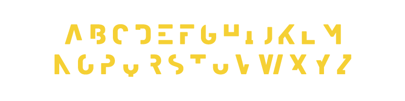
The Impact Dyslexia brand is simple and bold with heavy a heavy san-serif, Barlow, bright colors, simple graphics, and powerful images. Supporting messages are broken up and tightly stacked force non-dyslexics to pause to process, invoking greater sympathy for reading difficulties. Drop caps using partial letters further remind neurotypical people of the problem facing Dyslexics. These techniques are meant to foster understanding for everyone without creating a negative experience for Dyslexics visiting the website.